Ribometrix
A brand for the next frontier of drug discovery.
Ribometrix approached us with an all-star team, three rounds of funding and, most importantly, groundbreaking innovations in RNA-targeting technology. We’ve helped them take their next step by building a modern biotech brand with sleek visuals and plenty of iconography to let their science tell the story.
Our Expertise
- Design
- Brand Strategy
Capabilities Provided
- Technical Support, Hosting, & Maintenance
- Brand Positioning & Messaging
- Website Development
- Visual Identity
- Illustration & Iconography
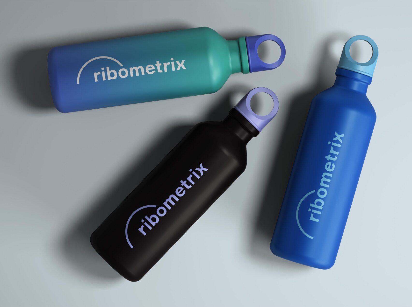
- Branded Materials
- User Interface Design
- Information Architecture & Content Strategy
- Pitch Decks & Investor

In earlier stages of the company, the molecular shape in Ribometrix’ logo signaled its field of expertise to investors and partners. However, we found that the company’s rapport had reached a level such that the name could stand on its own, allowing us to shift to a more versatile, refined identity.
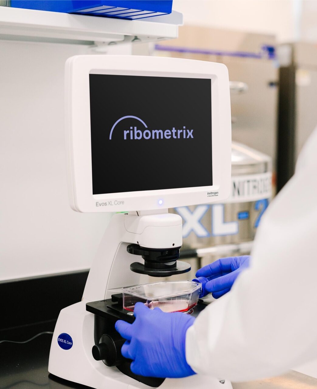
The new logo is a subtle evolution from Ribometrix’ original mark, retaining the arc and selecting a similar typeface in order to preserve visual signatures from the old logo.


Custom patterns add depth to the visual identity. Ribometrix is working in the realm of that which is not yet known, using new technologies to create novel treatments for rare diseases. The contrast between foreground and background, between solid color and gradient, creates an impression of discovery.

Ribometrix is a unique company, which calls for a unique set of icons. In addition to the standard iconography for office amenities, we designed icons to represent Ribometrix’ cutting-edge RNA modulation technologies. Yes, we had to open up a science textbook for this part. Yes, we still enjoyed it.
We can’t thank you and all the contributors at Rivers Agency enough for the hard work and creativity that brought our new website to life. Thank you from everyone at Ribometrix. We look forward to continuing to build the relationship between the two companies.