Technology, pop culture and fashion usher in new design trends each year that many brands quickly embrace to stand out from the pack. While some companies safely hitch their brand standards to the long-popular Helvetica train, others have gone down the less-traveled path of beveled and embossed fonts, only to find their materials dated soon after.

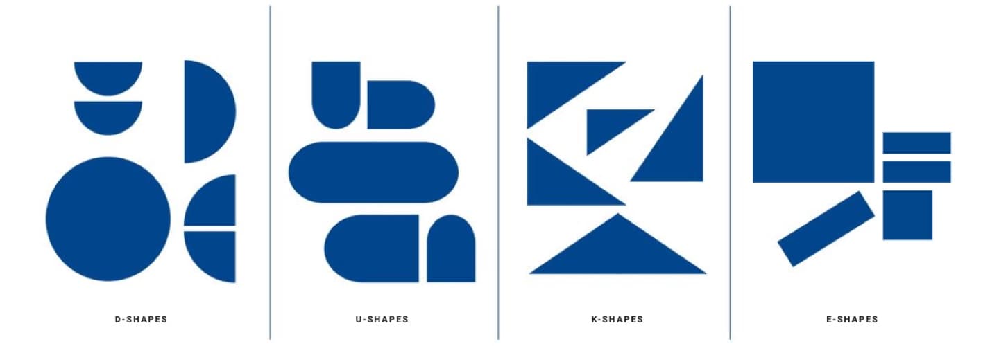
This year, the popularity of monochrome color filters, artistic and maxi typography, and shapes inspired by typography is on the rise. When incorporating new trends or elements like these into your advertising or promotional campaign, it’s important to consider which design style is right for your brand. At Rivers, we take our responsibility to create and champion good design seriously.
Let’s talk about what good design is and isn’t. Design has always been important to people, and good design helps create the positive experiences we have with brands and products. When our team at Rivers Agency sits down to design a solution for a business need, we always start by considering the human need behind it.
Good design is complex to create, but when done right, it not only looks good, it also performs well and captures the hearts and minds of its intended audiences. With thoughtful planning, good design can grow and change with you, creatively differentiating your brand in novel ways.
But before downloading the latest design software plugin and rushing to tap the newest trends for your next campaign, here are three questions to ask yourself first.
Is the trend a natural evolution of my existing brand?
You want to build off the brand you have already invested in and created. Veering too far from the existing look and feel could be jarring, confusing or even alienating for your customers. Gravitate towards trends that feel authentic to your brand and can complement your existing materials.

Where should I apply this design trend?
Some design trends find their way into a brand’s foundational elements, such as logos using the minimalist illustration style. That trend works well because it’s clean, versatile and legible at different sizes—all great qualities for a long-term commitment like a logo.
Social media, on the other hand, has a much shorter shelf life. This makes it an appropriate medium to experiment with design trends that could become dated in the near term, while still allowing you to push your brand outside its comfort zone.
Be sure the size and/or format of the medium is also suitable for the design trend. Small background patterns would make a digital ad difficult to read, but if applied to a billboard, could turn heads and garner more attention.
What are my competitors doing?
Before putting all your eggs into one design trend basket, make sure others in your industry haven’t claimed ownership over that aesthetic. At Rivers, we conduct a visual landscape analysis to assess what competitors are doing in their branding, advertising and marketing materials so we can confidently guide our clients in a unique design direction.
Check out what Adobe’s predictions are for this year’s hottest design trends, and if you want to know which ones are right for you, give us a call.
Rivers Agency is the premier design firm for Raleigh, NC, Chapel Hill, NC, Durham, NC and Carrboro, NC.