When you visit the Google suite or open the Uber app, chances are you aren’t paying too close attention to the fonts, colors and patterns on the page. Why? Because they seamlessly blend for a consistent and cohesive user experience (UX). Design systems are what makes this consistency possible.
Design systems are a set of assets which guide a website or app toward a cohesive look and feel. They have become an essential tool for developers and designers as they strive to create seamless UX.
Keep reading for details on the basics of design systems, and even explore some of the most inspiring design system examples on the web.
What is a Design System?
Defined by InVision, “a design system is a collection of reusable components, guided by clear standards, that can be assembled together to build any number of applications.”
This article highlights the standards and documentation in a design system, which work to answer designer and developer questions around the how and why of each asset.
You may be familiar with the concept of a brand guide, but what differentiates design systems from these guides? According to HubSpot, brand guidelines or style guides “govern the composition, design, and general look-and-feel of a company’s branding.”
In contrast, design systems turn information into something designers and developers can use for user interface (UI) betterment. From typography to buttons, icons and color palettes, these reusable elements maintain consistency across a brand.
Why Do Design Systems Matter?
We’ve talked about how design systems enhance UX and lead to an illusive consistency, but what does this really mean? Why do design systems actually matter?
For designers, design systems help to eliminate design debt, a term still catching on in the industry, but similar to technical debt, which accumulates due to technical problems on a site after a quick launch. Design debt takes shape in website inconsistencies, caused potentially by a fast launch, or just a lack of direction. These inconsistencies range from a UI that’s difficult to use to mismatched buttons. Design systems create a standard that keeps everything consistent, even as times change.
For developers, design systems improve efficiency by creating a common design language that developers can implement into the site. Through site updates and collaborative efforts, the system answers questions and acts as a guide for the technical side. Valentina Ali from Medium said it best, “Good design is a language, and when everyone speaks the same language, that’s when things get done faster.”
For users, they can tell when a website uses a design system. The buttons all match, the colors and fonts are the same and there are no strange design choices that distract from why you are there in the first place. This improves UX. For examples of excellent design systems, read our list below!
10 Inspiring Design System Examples
Here are some of the best examples of design systems from some familiar brands!
1. Google Material Design
From the designers and developers at Google comes Material Design! The latest version of the system, Material Design 3, is divided into three sections: foundations, styles and components. In Foundations, designers and developers find interaction states, accessibility information and design tokens, to name a few. Styles offers users color, shape, iconography, typography and more. And in Components are the building blocks for successful UI creation.
Material Design can also be used as a teaching tool, complete with the Material Design Blog that shares educational information about design best practices via blog posts and videos.
2. Atlassian Design System
Atlassian Design System aims “to create simple, intuitive and beautiful experiences.” How? By providing designers and developers with what they need to succeed. Not only does this interface include Foundations like color, iconography and typography standards, but their Brand and Content sections help employees contributing to the Atlassian site do so with a clear idea of the brand’s mission, personality and promise, as well their writing style.
3. Uber Base Web
In 2018, Uber formed a team of engineers and designs to create their design system, Base Web. This React component library teaches employees how to effectively interact with their myriad web applications. At its core, Base Web strives for reliability, accessibility and customization. One unique feature? Uber allows users to send improvements to Base Web by contributing their code publicly via GitHub.
4. Dropbox Design System
Dropbox compiled their guidelines for design all in one place, and it’s called the Dropbox Design Standards. This guide includes the strategy behind the design, a toolbox of foundational brand elements, systems information, writing guidelines and resources on the customer journey. They also have educational content in article form!
5. Salesforce Lightning Design System
Salesforce’s Lightning Design System has resources for designers and developers alike, as well as fun visuals using the iconic Salesforce character Astro to explain along the way! For designers, Salesforce has guidelines for product design and a components section, making it easy to align every creation with the brand. For developers, there are Markup and Style guidelines, the Components library and information specific to each platform. The Lightning Design System shines if you are working with AI, content marketing or sales.
6. Microsoft Fluent 2
Microsoft’s design system, Fluent 2, has all the bells and whistles a design system should. It has also been on a mission to further improve collaboration and creativity. The team at Microsoft built upon Fluent 1 to add standardized corners, a cohesive color system, customizability, a token system, accessibility notation and robust usage guidance to Fluent 2.
7. Mailchimp Design System
Mailchimp went through the hard work of creating a design system and new brand identity, and the results are amazing. Side note, their playful yet simple illustration style makes all of their pages pop! When it comes to the Mailchimp Design System, they said “the goal of this platform is to make it as easy as possible for you to grow your business while also staying true to your brand identity.”
Use this system to choose the right typography, visualize data or make a grid system conveniently. Additionally, Mailchimp’s Pattern Library is an excellent example of how brands choose a few colors as primaries, then play with tint to expand their design options.
8. IBM Design Language
From typeface to philosophy, color, photography and more, IBM Design Language includes guidelines and tutorials to help users with their design. Organizations that have more web traffic tend to frequent this design system, which includes “numerous patterns and data visualization tools that can help you track what is most important to the experience of your users.”
9. Shopify Polaris
Shopify Polaris is there to help Shopify admins design and develop with ease and consistency. For design resources, Polaris has style and icon libraries, as well as UI components. For development, they have design tokens, react components and VS code extension. And to learn even more, Polaris offers tutorials, like this one on building a Shopify app!
10. Airbnb Design
Last but not least, Airbnb Design was created by a group of talented technologists, graphic designers, project managers, researchers and so many more set on creating a design system. The principles embedded into each design are unified, universal, iconic and conversational. This results in a shared understanding of style and streamlined teamwork.
How to Create a Design System
If your company needs a design system, this may feel like an overwhelming undertaking. What are all of the pieces of a design system, and what if I forget one of them? Where do I even begin? Start with these simple, yet essential questions.
- What are my design principles?
Look at your brand and determine the current principles guiding the design of your website or app. Note any inconsistencies with these principles and if they fail to align with your brand’s goals. - What is my style?
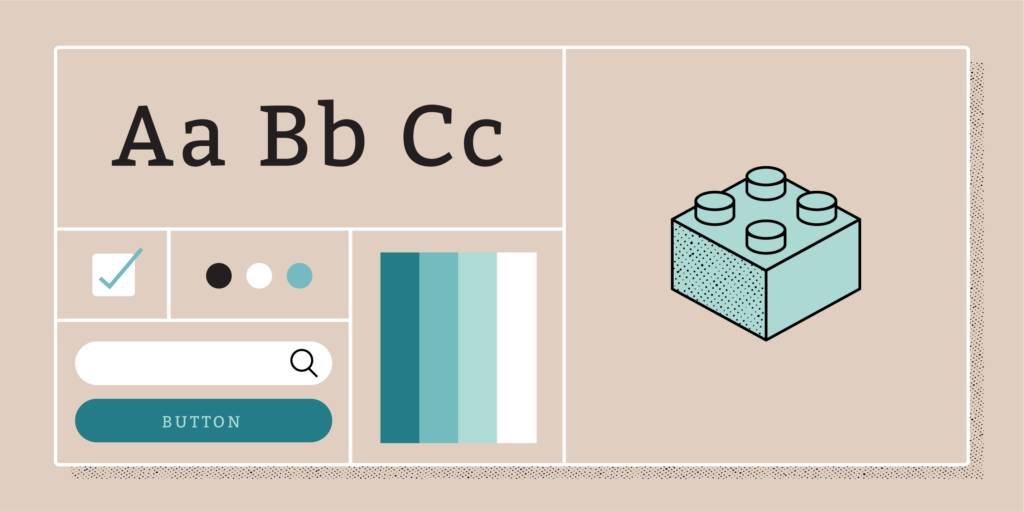
Now, hone in even more on the visual design language of your brand, creating a brand guide from your discoveries. According to InVision, your four must-have elements are color, typography, sizing and spacing and imagery.
Color: Design systems often contain one to three primary colors for a brand, with plenty of tints for variety.
Typography: Design systems regularly include one font for body copy and headings, and another font that’s monospace for code.
Sizing and Spacing: Consider adopting a 4-based scale for sizing and spacing, which creates balance and consistency.
Imagery: Design systems guide designers when it comes to creating illustrations, and also often include a set of icons. - What are the components of my UI?
Take a good, long look at what you currently use for your UI. Take note of the buttons, cards and forms. Make sure you want to continue with all of them, and that all of these assets adhere to the brand guide you have already completed. - Does this information make sense?
Include standards for when an asset is supposed to be used, and why. For example, make note if a specific button goes with a specific product.
Now that you know more about the benefits of implementing a design system for both employees and site users, it’s time to get started building your own! As an advertising agency with a team of highly skilled designers and developers, Rivers Agency is well equipped to help you on this journey. Reach out to us today to learn more about how we can make your design system dreams a reality.