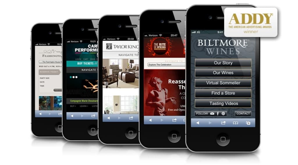
Times have changed. Desktop computers, which revolutionized information sharing, are steadily being phased out. With smartphones, tablets and touch-screen laptops, everyone has access to a computer all the time. Average smartphone usage grew 81% in 2012. You need to be on the move because your audiences already are. In short, companies need to go mobile.
Here at Rivers Agency, we stay on top of technology. We make sure our clients know what changing trends mean for their business, and what we can do for them. With the way technology continues to improve, having a website simply isn’t enough anymore. Even the speed of mobile network connections is predicted to grow at a rate of 49% annually, which translates to mobile devices being more efficient and more capable each year. Companies have to be mobile-friendly or they will fall behind.
We feel the best strategy for these changes is a simple one: work with the technology that best fits customer use. Our main strategy involves creating mobile apps for our clients. Is it easier to navigate a social media site, like Facebook, through a smartphone’s web browser, or through the Facebook app?
For other clients, we use responsive web design to best fit their needs. Responsive web design is when a site automatically detects the device a visitor is using and formats itself in the most optimal way for that device, regardless of whether it’s a smartphone, tablet or PC.
Say you own a restaurant. When someone visits your website on their phone, they are most likely on the move. They are probably not working with the greatest reception and are looking for a menu and directions – basic information – but they need the page to load quickly. What happens if you have huge pictures of all your entrées because they look great when viewing them from a computer? It will cause your page to take too long to load on their phone, and you just lost a customer. Responsive web design allows you to give your audience what they want, when they want it, in the way that’s best for their situation.
View examples of our past work here. And if you’re interested in seeing work in action, check out our fully integrated responsive web design with Carolina Performing Arts and its Rite of Spring at 100 program, or take a look at the newly renovated and fully responsive design for the Fearrington House.