At Rivers Agency, every new mission we accept is built on the principle that a brand is only good if it is consistent. From decisions about the overall message and design to the minute details of font choice, Rivers is attentive to how your brand’s message represents you.
This is especially evident in our successes in the sphere of medical marketing. Since 1993, Rivers has worked in all dimensions of medical health care marketing and communications. So it was only natural that, when searching for a revamped menu print design that would embody its reputation as a nationally recognized health care provider, UNC Health Care called on the branding experts at Rivers Agency. Accordingly, Rivers created an exciting logo design and color palette to emphasize the hospital’s vision of contemporary cuisine and excellent service.
Rivers has been honored to perform medical health care marketing and communications for Chapel Hill’s nationally ranked hospitals. We have particularly shown our strengths with medical health care website design. In 2011 Rivers launched mombaby.org for the UNC Center for Maternal and Infant Health. The website is an informative and intuitive site for both new mothers and doctors with pregnant patients. Rivers also designed the website for the No. 2 pharmacy school in the country—the UNC Eshelman School of Pharmacy. The site features easily navigable programs, research and admissions information for the thousands of students, professors, professionals and prospective students who access it.
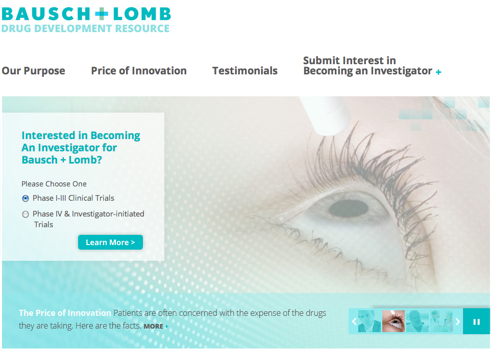
Continuing that mission of sustaining a brand through a company’s various endeavors, Rivers Agency helped a leading maker in contact lenses extend their services from eye care company to include pharmaceutical drug development. Bausch + Lomb’s new website attracts health are practitioners interested in participating in clinical trials. Rivers has also programmed and designed websites for the North Carolina Medical Journal and The North Carolina Institute of Medicine.
In the city of Birmingham, Alabama, where diabetes is a serious concern, medical health care website design places a premium on being user-friendly and accessible. With that in mind, the design team at Rivers built a site that provides residents with an abundance of interactive resources that are easily searchable and tailored to the individual.
Beyond website programming and design, Rivers’ team is also creative with packaging design. Medi, a B2B innovator in compression therapy, consulted our print designers for a product packaging design. Rivers produced a package that detailed the sizing and instructions for product use, all within a color scheme consistent with the Medi brand. Our creative team also compiled an illustrative and educational medical health care catalog for Medi, available in both print and digital versions.
We’re proud to say that we have a long list of satisfied clients who trust us to nurture and grow their brand and message. Take a look at some of our work and contact us if you like what you see. We’d love to get started putting together a plan to care for all of your medical and health care marketing needs.