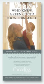
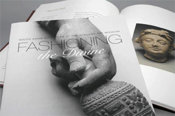
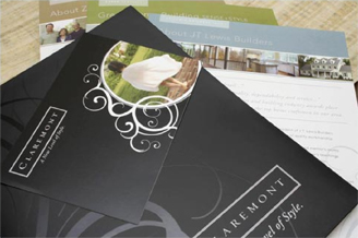
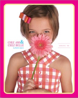
Rivers Agency is a full-service advertising agency with a strong client-first ethos and a reputation of professional design within reasonable cost. With a dedicated staff specializing in print design, we at Rivers Agency are capable of producing a wide range of printed materials – from informative brochures and booklets to consumer and trade catalogs.

At Rivers Agency, a good page layout is more than just information on a page or a flashy visual. A workable page layout is one that delivers the intended message to its primary audience while taking into consideration the practical aspects of the document, such as method of distribution, visibility and handling. Each of our pieces carefully considers the principles of graphic design, including balance, color, line and proportion.
The primary goal of many of our print design pieces is to have the audience remain on a page long enough to receive its marketing and branding message. We always discuss with our clients the intended purpose of the piece – for some, an eye-catching cover needs to pull the reader into an informative booklet or brochure. For others, imagery and type needs to create a mood and promote the brand.
How do our designers create beautifully organized and striking designs in the limited space of print restrictions? It takes talent and training with layout, colors and typography. Our designers are always conscious of dealing with a physical product, taking into consideration properties such as texture and shape to help guide the design process.
Typography Basics:
Typography has evolved with the advances in printing and computer technology. Most fonts will fall into the category of three font file types:
OpenType fonts allow for an extremely large character set, meaning the same single file can contain additional characters, languages and figures that might previously have been released as separate files.
TrueType fonts make up the majority of fonts that come automatically installed on Windows and Mac operating systems, though OpenType fonts are the current standard.
PostScript fonts have two parts. One part contains the information to display the font on screen and the other part is used for printing purposes.
Print Design Layout and Tips:
According to an About.com article about print design layout, there are three basic tips for professional print design:
Build the page layout around the main message.
All elements of the page layout including images, fonts and colors must be appropriate to the message the piece is designed to convey. Identifying the main message will allow you to create an appropriate tone with a page layout that delivers the message effectively.

Choose a page layout size that fits the intended or expected use.
Always consider the recipient, budget, need for portability or filing and postal regulations when selecting the best page layout. The standard tri-fold format for a brochure, tabloid size for a newsletter or an oversized postcard size for a direct mail piece are all appropriate and proven options.

Plan a page layout around how a piece is seen and handled.
Think about the visibility and use of a piece when arranging page elements. Does the title, headline, label or key visual need to be visible, readable or recognizable from a distance, from a magazine rack, on a shelf or in a binder? These considerations will allow the design to be functional as well as attractive.

Do you have a need for a printed project – large or small? Rivers Agency is your source for quality design and quick turn-around in Chapel Hill, Carrboro, Raleigh and Durham.