As society shifts to a greater dependence on the internet for discovery, information, and a huge range of everyday services, it has become more important than ever for the higher education industry to deliver seamless online platforms that appeal to prospective students. This increased digital emphasis makes higher education websites key players in the customer’s “Zero Moment of Truth” or “ZMOT.” As prospective students begin their journey to identify programs of interest, your website is a first glimpse for many into the vast realm of higher education, making this moment essential in converting students from prospective targets to enrolled learners.
At Rivers Agency, we have a talented team with a proven track record and a deep portfolio of higher education work that includes Duke University Community Affairs, UNC School of Public Health and the Morehead-Cain Foundation. Read below to learn some of the keys to success in higher education branding and website design and explore Rivers’ experience working with a variety of institutions to create websites with a compelling ZMOT.
1. Create a story that’s easy to navigate.
Your institution’s website should tell a story about the higher education experience. What is it like to eat, sleep, learn, and live there as a student? What resources are available to ensure student success and give parents peace of mind? How do faculty and staff play a role in facilitating the transition to campus life and shaping the student learning experience in and out of the classroom? It is essential that higher education websites provide compelling testimonials and success stories from real students, parents, faculty and stakeholders to paint a holistic picture of life at the institution. Be intentional with your copy and imagery to evoke a greater emotional appeal and create a true connection between the prospect and your institution from the jump.

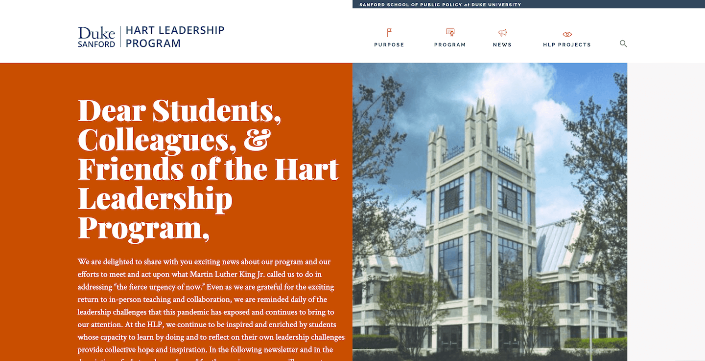
On top of this, successful sites elevate the user experience with visual elements such as pictures, graphics, tables, graphs, schedules and timelines. Rivers Agency’s web design and development team incorporated a variety of creative graphic elements for the Hart Leadership Program website within the Sanford School of Public Policy at Duke University. Our team used a mix of bright colors, impactful stories and easy-to-access event calendars to tell an engaging, cohesive story about the program.
2. Design a fun and functional website.
Higher education websites are meant to simplify the search and the decision process, not complicate them. Functionality is especially important in higher education because when the website serves as the ZMOT, it becomes the initial impression of how the audience perceives your university or program. If your website functions poorly, there is a greater chance your target will have a less-favorable perception of your institution versus an institution with an exceptional website. By creating a better digital experience with multiple touchpoints for both prospective and current students, higher education programs can capture increase both site engagement and program enrollment. In this case, the back-end development becomes just as crucial to user experience as the front-end.

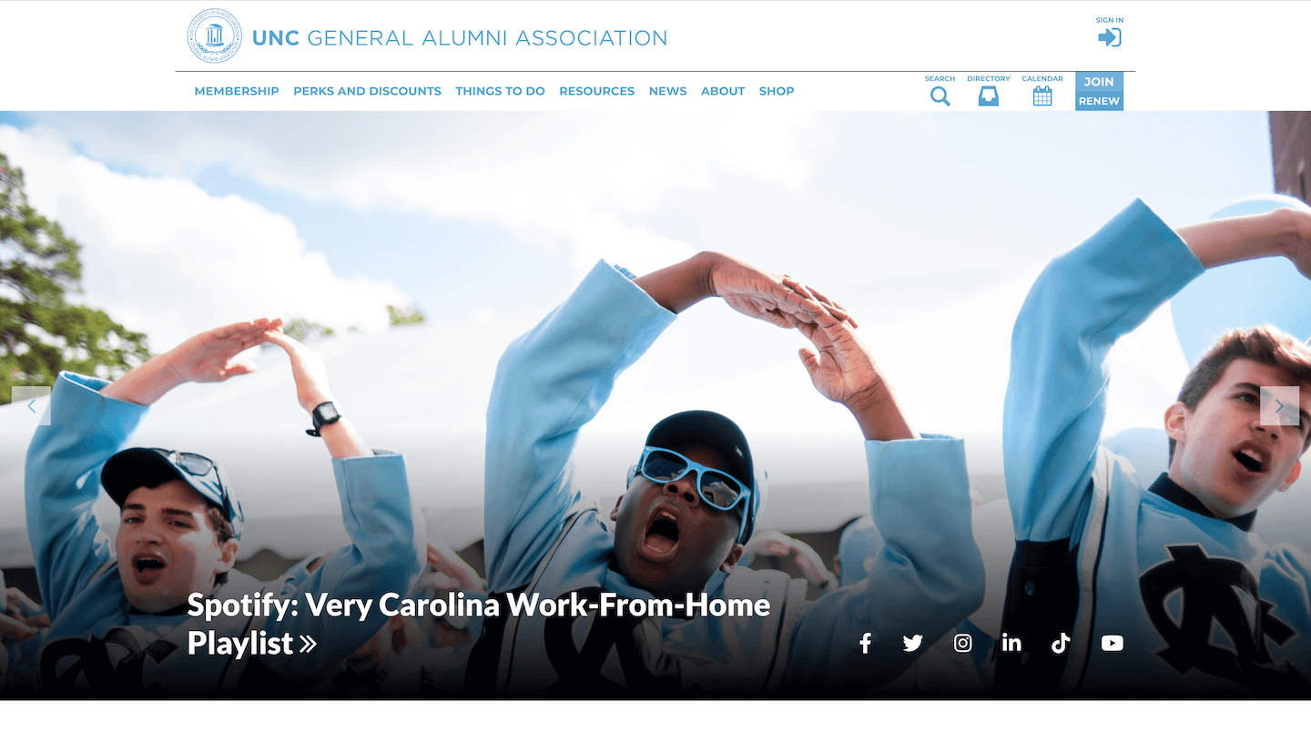
User interface, software and content management systems (CMS) should be specifically tailored to the higher education customer journey to support accessibility and ease of use. Considering UNC General Alumni Association’s (GAA) extensive offerings in the form of events, records, perks and discounts, publications and travel opportunities, Rivers Agency knew the association needed a highly organized, practical website. Our team designed UNC GAA’s website with the intent to mix fun and function in a highly interactive, multi-purpose platform.
3. Focus on consistency.
There are thousands of higher education websites available on the internet, so your site must establish why you’re different. This all comes down to your university or program’s branding. Your branding tells the story of who you are and what you’re about. Keep a consistent color scheme, typography, design and theme throughout the website for a cohesive look that captures viewers’ attention and depicts your brand. This also will create a more organized look with better usability that site users are better able to navigate. A strong higher education website is one that appears seamless, up-to-date, and top-notch to prospective students, translating into a positive perception of the program.

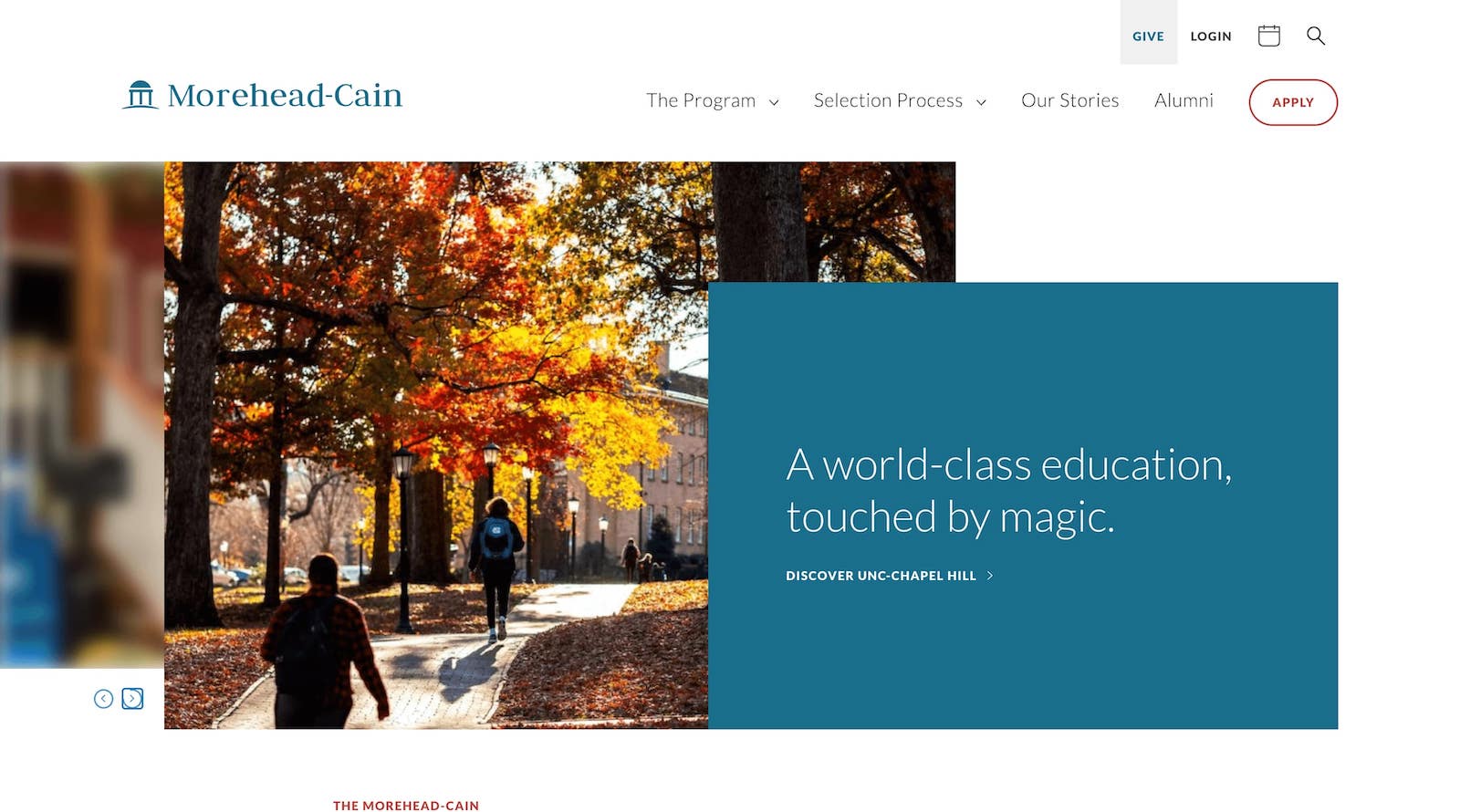
In Rivers Agency’s work for the Morehead-Cain Foundation website, our web design team put consistency at the forefront to convey the Morehead-Cain experience. We achieved this through a professional design incorporating a sophisticated yet restrained look with consistent brand colors, graphic icons and typography throughout the site. From this platform, potential candidates can learn more about the selection process, program benefits, and history in an easily digestible manner that presents Morehead-Cain as the distinct honorary experience it is.
4. Incorporate interactive elements.
One of the greatest advantages that websites have over print is the aspect of interactivity. In the higher education search and the decision process, interactivity is key to sparking the interest of prospective students.
To keep your program on the prospect’s radar, your website must convince them that (1) they belong there, and (2) that they should explore the program beyond the website. With forms, surveys, interactive admissions data pages, and contact options your site can serve as a personalized experience. Information recorded from these forms are an extremely useful tool for segmentation while targeting a wide audience. When prospective students receive an offer that feels tailored to them individually, you’ll see a higher retention rate of those who return or enroll.

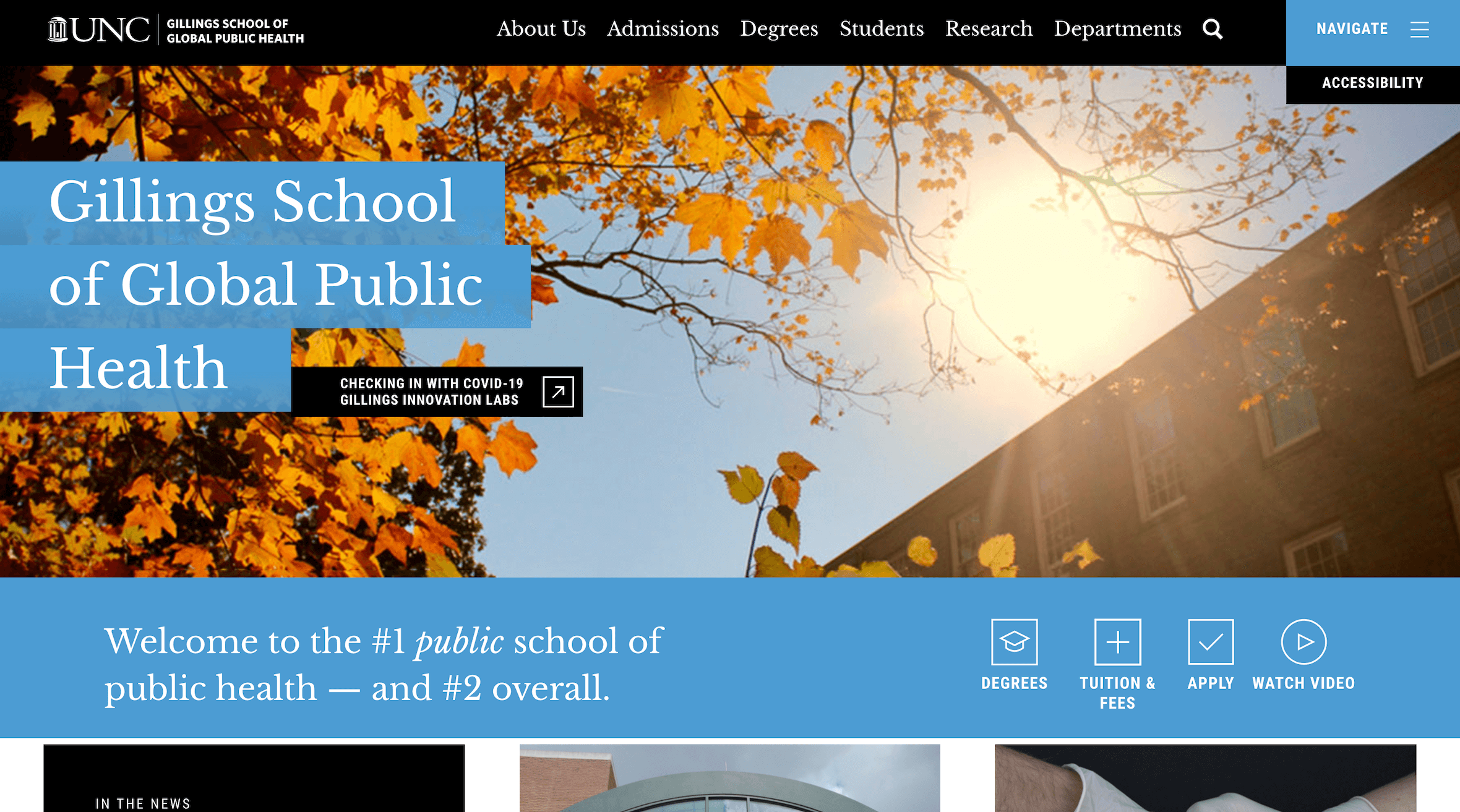
A great example of this is our website work for UNC’s Gillings School of Public Health. Rivers Agency incorporated several interactive elements throughout the site to promote engagement and retention, while gaining user information. The Admissions page features a student inquiry form, information requests and accessible contact details to give prospective students key information at their fingertips.
5. Answer questions before they’re asked.
Lastly, website visitors shouldn’t be doing the heavy lifting. Higher education websites should serve as an answer to all their audience’s questions — before they even know they have them. Create easy-to-read, informative page designs to avoid overloading viewers with an abundance of information at once. Incorporate elements such as FAQs, videos, infographics and bullet points to present otherwise dense information in an easily consumable manner. Convey clear expectations, requirements, and logistics on your website, displayed in an easy-to-read design and both students and parents will have a positive feeling about your school or program before they even set foot on campus.
Looking for a cutting-edge, effective website for your higher education institution or program? Rivers Agency is an award-winning team of designers and developers committed to creating stunning website interfaces that facilitate a seamless user experience. As a forward-thinking design agency, Rivers is a leading web designer in the Raleigh, Durham and Chapel Hill, North Carolina areas. Our team designs and develops websites that elevate your brand’s digital footprint and achieve your business goals. Let’s work together!