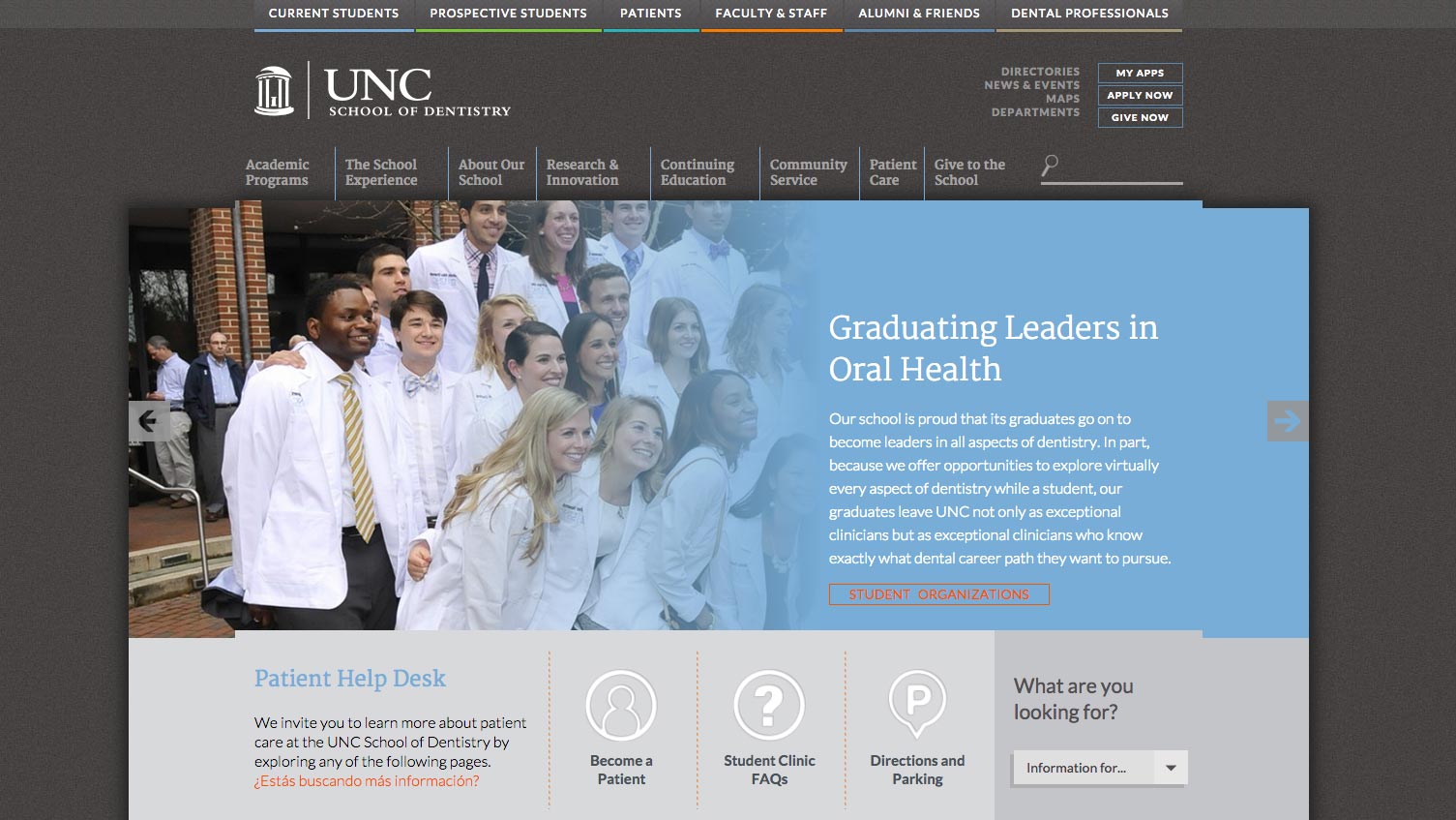
We’re proud to announce the launch of a redesigned and developmentally enhanced, cavity-free, website for the University of North Carolina at Chapel Hill School of Dentistry.

The new website reflects the spirit of engagement, dedication and scholarship surrounding the dynamic community of professors, researchers and students at UNC Dentistry. Its fresh new design delivers an outstanding user experience with expanded graphics, content and accessibility reflective of the innovative work being completed by the department.
As we began the redesign process of the website for North Carolina’s historical first dental school, established in 1950, we quickly realized the challenges of accommodating the individual needs of the diverse sets of audiences who would be using the site.
- – students needed information on classes
- – prospective students needed information on the world-class programs
- – patients needed to find out about appointments and directions
- – faculty and staff needed resources, calendars and policies
- – alumni needed to quickly find out about associations
- – professionals needed continuing education info
To address these varied needs our in-house marketing, design, and development teams, after some tough idea flossing, created an x-ray proof website dental plan.
One of the standout design features – complementing the extensive updates to the site’s architecture – is the implementation of color-coded audience landing pages. Each color corresponds to a core audience with quick links to the most viewed content rinsed with the ability to customize each landing page as a homepage for future visits. These dramatic changes extend throughout UNC Dentistry’s site and make it easy for each group to find the information of interest.
In addition to updating the UNC School of Dentistry brand and the site’s look and feel, we made a lot of improvements in content placement and navigability to make the visitor experience richer. We also improved back-end functionality so that the site is simpler to update. We used a custom WordPress-based content management system that includes personalized tools and shortcodes written specifically for quickly and easily creating new pages and making updates to complicated template layouts.
In today’s mobile world, sites must provide a dynamic rich user experience when using a mobile or tablet device. This fully responsive website and will adapt to the device from which it is viewed, offering the optimized viewing no matter the medium.
Take a look for yourself today at dentistry.unc.edu