In the digital age, every budding business needs a website, designed with intention and care. At the same time, many have never considered how a website comes to be; they are just always there. Creating a website is a multi-step process, and it doesn’t end once the site is launched. With the ongoing maintenance and content updates, businesses must be continuously in-tune with their virtual presence.
As an advertising agency with a full team of designers, strategists and developers, Rivers Agency has helped dozens of clients create a thriving website, and we would love to help you do the same. In this two-part series, we will start by looking at the design side of building a website, then venture into development. But before diving in, let’s start by answering everyone’s first question: Why does web design matter?
The look, feel and function of your site introduces visitors to your business. Beyond a strong first impression, WebFX lists search engine optimization (SEO), brand consistency, building trust and excelling in customer service as other important reasons for a solid design. Continue reading to learn about our web design process and how to get the design of your site right.
Understanding the Client’s Vision and Objectives
Like any successful project, it’s important to dedicate time to identifying the goals of your new website so designers and developers can deliver on those expectations. To do so, Rivers starts with a discovery session between our client and our team. In meetings like this, Webflow recommends asking a series of questions.

First, establish the purpose of your website. Your site should resonate with the goals of your business. For example, if your business is an online retailer for sunglasses, a feature for customers to virtually try on glasses could increase purchase likelihood. If you are an appointment-centered business, your website may serve as a place where patients can easily book an appointment.
Next, if you currently have a website and are updating it, identify its problems. From slow functionality to a checkout that takes too long, there are plenty of things that could be hindering your business. If you are rebranding, it is important to flag visual elements like colors and icons that may be out of date as well. And don’t forget about what you like about your site so these elements are carried over to the new product.
Conducting Research and Market Analysis
Our agency then completes thorough research that analyzes the market, your audience and your competitors. Research is important because it informs design decisions, and HubSpot shares the specific types of research designers, strategists and developers should be engaging in.

Researching and identifying your audience, including their likes and dislikes and browsing habits, makes sure your site is one they want to visit; one that meets their needs. In the same way, HubSpot says researching competitor sites helps you identify what you like about their design, and what you think you could do better.
At Rivers, our proprietary research methodologies are at the core of our competitive edge, employing specialized surveys and advanced data analytics techniques to deeply understand market dynamics, audience preferences and the competitive landscape. These methods allow us to tailor web design and development strategies so they are not only unique but also highly effective in meeting our clients’ objectives.
By leveraging these specialized tools, we ensure that our clients’ websites not only stand out in a crowded digital space but also deliver tangible results in terms of user engagement and conversion rates, thereby creating a significant competitive advantage.
Setting up a Strategy
From here, strategists and web developers create a strategy for the design and function of your site. Some of the areas in which strategists advise are content strategy, SEO and user experience (UX) and user interface (UI) design.
SEO refers to a series of steps you must take if you want to ensure your website appears high in Google’s search algorithm, or the Search Engine Results Page (SERP). Google’s search bots, or Googlebots, will index your site’s content so that, when someone’s search is relevant to your content, the algorithm will decide where to display your site on the SERP. To learn more about SEO best practices, check out our blog post on the topic.
As for content strategy, remember that words matter. The written content you choose to display on your site not only convinces readers to keep reading, shopping or engaging, but content optimization positively contributes to SEO. Those Googlebots also evaluate how comprehensive, original and well written your site is.

UX and UI are both important parts of your site design. And while they are only a letter apart, they do different things for your site. According to Columbia Engineering, UX focuses on the feel and big picture view of a website, using testable prototypes and wireframes to outline work. On the other hand, UI centers on the look and details of the site, finalizing the design for users.
At Rivers, we have a whole team of expert strategists, each equipped with an impressive set of skills to enhance your web design. These digital and brand strategists work closely with our account managers to advise clients on effective web designs and how to optimize paid and organic media to drive traffic.
Case Study: Brand Strategy for University Place

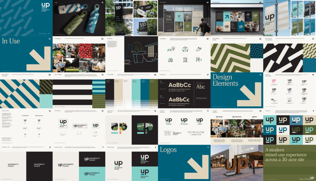
A centerpiece of Chapel Hill commerce since 1973, University Place holds a special spot in the memories of local families and students alike. Now undergoing a transformation into a mixed-use community hub, Rivers was excited to partner with Ram Realty Group to bring their modern, urban vision for the property to life.
The designers, developers and strategists on our team created colorful wayfinding signage for UP. We also developed an illustration style that aligns with the timeless energy of UP, one that has pulled residents in for years. From the colors and typography to the vision page for this client’s site, UP’s brand clearly shows visitors the direction this development is going… and that’s up!
Designing and Prototyping
It’s time to learn more about how a team like ours works to take the vision, research, and strategy for your website and turn it into a cohesive design. With more color schemes, typography choices, and imagery styles than we can count, how do designers decide which elements to use, and how do developers make sure everything stays consistent across the pages of your site?

One such tool for this conundrum is a design system. Design systems are a set of assets which guide a website or app toward a cohesive look and feel. They include assets like the shades and hues of your color scheme, the typography your site uses, the icon and button styles, and more. But unlike a brand guide, design systems don’t stop there. These interfaces also instruct designers and developers on how to use these assets, leading to UI betterment.
Specifically for developers, design systems matter because they improve efficiency and create a common design language for site updates and collaborative efforts. To explore excellent design system examples, read our blog on the topic.
Another important aspect of web design is accessibility. User-centered design puts the accessibility of your site top-of-mind, and this matters for creating a more inclusive world and web. Medium defines accessibility in the digital landscape as “creating digital products, such as websites, apps, and software that are designed to be used by people with disabilities or impairments.”
To design a website that appeals to accessibility standards, Medium lists four considerations. First is the use of clear language, promoting understanding for all. Second is making sure colors and backgrounds have clear contrast. Third is including alternative (alt) text on all non-decorative images so it can be read aloud by a screen reader. And lastly, make sure every aspect of your site can be controlled with a keyboard, as mice and touchscreens are not friendly to users with mobility impairments.
All About Prototyping
Before developers dive into coding, designers create prototypes of your website. These are digital mockups, both static and interactive, that give you a sneak peek into how your site will look and function.
These prototypes start simple, so step one is wireframing. Think of wireframes as rough sketches that map out a site’s layout: where the navigation bar goes, where the images will be placed and how the content is organized. This stage allows clients to give feedback on structure and flow without the distraction of new design elements.
Once the basic layout is approved, designers create high-fidelity prototypes. These look closer to the finished product, with colors, fonts and even some interactive elements. Here, you can get a feel for usability and test out features like clicking calls to action or navigating the site pages.
To gather feedback, designers use online collaboration tools. These platforms allow client teams to leave comments directly on the prototype, highlighting the elements they like or suggesting changes, without requiring additional software or technical expertise. This back-and-forth ensures everyone is on the same page before moving on to development.
Rivers Agency: Your Web Design Experts
Design is in our DNA here at Rivers, and we take pride in helping our clients feel confident about the design of their brand and their website. The steps of web design may feel daunting, but our team has created dynamic and successful sites for scores of clients and would love to help you do the same.
Make sure to look out for Part Two of Your Ultimate Guide to Building a Website, where we will take a look at the development of your site. And to get started building your online presence with authority and consistency, reach out to Rivers Agency today through our contact form.